The Donald Trump campaign is clinging to any shred of evidence it can find that shows the beleaguered GOP nominee in a competitive race with Hillary Clinton.
Most polling and forecast evidence points to a sizable win for Democrats on Nov. 8. But there are a few national polls that team Trump can cherry-pick to claim a lead.
So how do we know these polls are wrong in showing Trump ahead? Well, to be perfectly honest, we can’t know with 100 percent certainty until all votes are cast and counted. That said, the basics of polling error indicate that the polls showing Trump leading are likely “outliers,” either by statistical chance or by design.
There are lots of opportunities for things to go wrong in polls. Survey experts generally point to five areas where things can go awry: sampling, coverage, nonresponse, measurement and post-survey. These five areas make up the “total survey error” that researchers seek to understand.
The “margin of error” that most (but not all) polls report only addresses the potential for sampling error ― that is, the error produced by interviewing a random sample rather than the entire population whose opinion you’re seeking. Based on the sample size, statistics and a few other factors, the pollster can calculate the margin of sampling error. This describes how close the sample’s results likely come to the results that would have been obtained by interviewing everyone in the population — in theory — within plus or minus a few percentage points.
Even under the best circumstances, polls can vary widely because of sampling error. A common misconception is that the margin of error means the true value is definitely within that range. It isn’t. The margin of error means that 95 percent of the time the true value will be in that range. The other 5 percent of the time? The poll could be way off. We’d expect that to be true in about 1 in 20 polls ― just based on sampling error.
But there’s way more than sampling error in play. “Coverage” refers to having the ability to sample from the entire population ― for example, a poll done online can only reach people with internet access. A poll that uses only landline telephone numbers can only reach people with a landline. “Nonresponse” refers to all the people pollsters try to reach but can’t. “Measurement” refers to whether questions asked and answered actually measure what pollsters are trying to get at. And “post-survey” refers to anything analysts do with the data after collecting it, including weighting and likely voter selection.
We’re just not sure as an industry how to measure problems in these other areas, so the only thing that gets reported is the sampling margin of error. Very smart people are working on these problems.
With all that in mind, it’s kind of amazing any two polls show similar results. All polls differ at least slightly ― and some in every possible way ― in their methods. Consistency in a large number of polls means they’re probably pretty close to reality. We have a whole lot of consistency in showing Clinton ahead nationally. Plus, national polls have a decent track record of being right in U.S. general elections.
(I’m assuming here that pollsters’ primary concern is to be accurate. Some might have ulterior motives, but I firmly believe that most are driven by wanting to be right. There’s always the possibility that consistency is a result of “herding,” or slightly tweaking results to appear more like other pollsters, but that assumes a baseline of some consistent polls to herd to.)
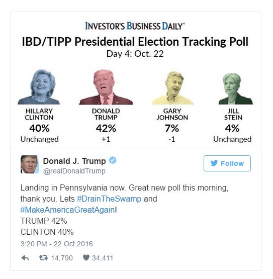
Three pollsters have shown Trump leading in recent weeks: Rasmussen, Investors’ Business Daily/TIPP and USC Dornsife/Los Angeles Times. The USC/LA Times poll results can be easily explained by its unique methodology ― it asks “What is the percent chance that if you were to vote, you will vote for Clinton, Trump, or someone else?” instead of a traditional “Who would you vote for?” question. For that reason, the poll hasn’t been included in the HuffPost Pollster charts.
Rasmussen polls often lean more Republican than other surveys. Whether that’s intentional or a result of its landline-heavy automated polling methodology, we don’t know. (It supplements with online polls, so it’s still included in the HuffPost Pollster charts.) Lots of poll-watchers suggest that it’s intentional, but there is not any concrete evidence of that.
The IBD/TIPP poll is a bit more puzzling. This poll performed pretty well in 2012 and is generally highly regarded. However, it seems to be the victim of survey error. The numbers look very different from other live-interviewer telephone polls, showing Trump leading overall and Clinton’s leads in key subgroups smaller than in many other polls.
The numbers themselves aren’t reason to label a poll an “outlier” ― sometimes the first poll to show a trend unfairly gets that label. However, there’s no contextual reason to believe that there’s a trend of support moving toward Trump. The campaign is flailing, and there haven’t been any new Clinton scandals of the magnitude it would require to reverse her sizable lead.
Bad samples or other errors happen to even the best pollsters. When the Trump campaign or supporters try to leverage the three national polls that show him leading, keep in mind that more than 30 in October have shown Clinton ahead. The likelihood of that many polls being wrong is very low.
END

Be the first to comment